Anyone who stays around here for any length of time can probably tell that I am a girl who adores color. A bright color palette makes my heart sing, and I generally gravitate toward bold, happy colors in my projects. I have been absolutely flattered to hear from several readers that they enjoy my use of color, and I have been asked by a couple of you how exactly I go about choosing the color schemes for my creations. It would be disingenuous to claim that in every project, I put a hefty bit of technical thought into the colors I use. I honestly just tend to gravitate toward the colors that make me happy, but I do know that my personal preferences have definitely been influenced by the things I have learned through researching color theory and putting that knowledge into practice.
Most of us have probably been exposed to the color wheel at some point in our lives, but in case you haven’t, never fear! Here’s a quick run-down of what it’s all about.
It all starts with our primary colors: red, yellow and blue.
Mixing our primary colors yields our secondary colors: green, orange, and purple.
Our basic color wheel is rounded out with our tertiary colors, which are formed by mixing a primary and a secondary color: yellow-orange, red-orange, red-purple, blue-purple, blue-green and yellow-green.

Now, in this bold spectrum of color, you may have noticed there is something integral missing: our neutrals. These are our blacks, greys, whites and browns.
Now that we have discussed all of the colors at our disposal, how might be go about using them in appealing ways? I’m so glad you asked! Let’s first talk about two different types of color – cool and warm – and the moods they convey, and then we’ll move onto different schemes that help us harness the available potential in the color wheel in dynamic ways.

I cannot think of any project that exudes a warmer feel than this lovely paper towel (can you believe it?!) wreath from Made by Nicole. Gorgeous.

Complementary Color Schemes – These are colors located directly opposite each other on the color wheel: red/green, blue/orange, yellow/purple. Complementary colors, when used together, really make each other pop. Prepare for bold results when you choose this type of color scheme for your project! For optimal color harmony, strive to let one of the complements take the lead while the other takes on the supporting role.
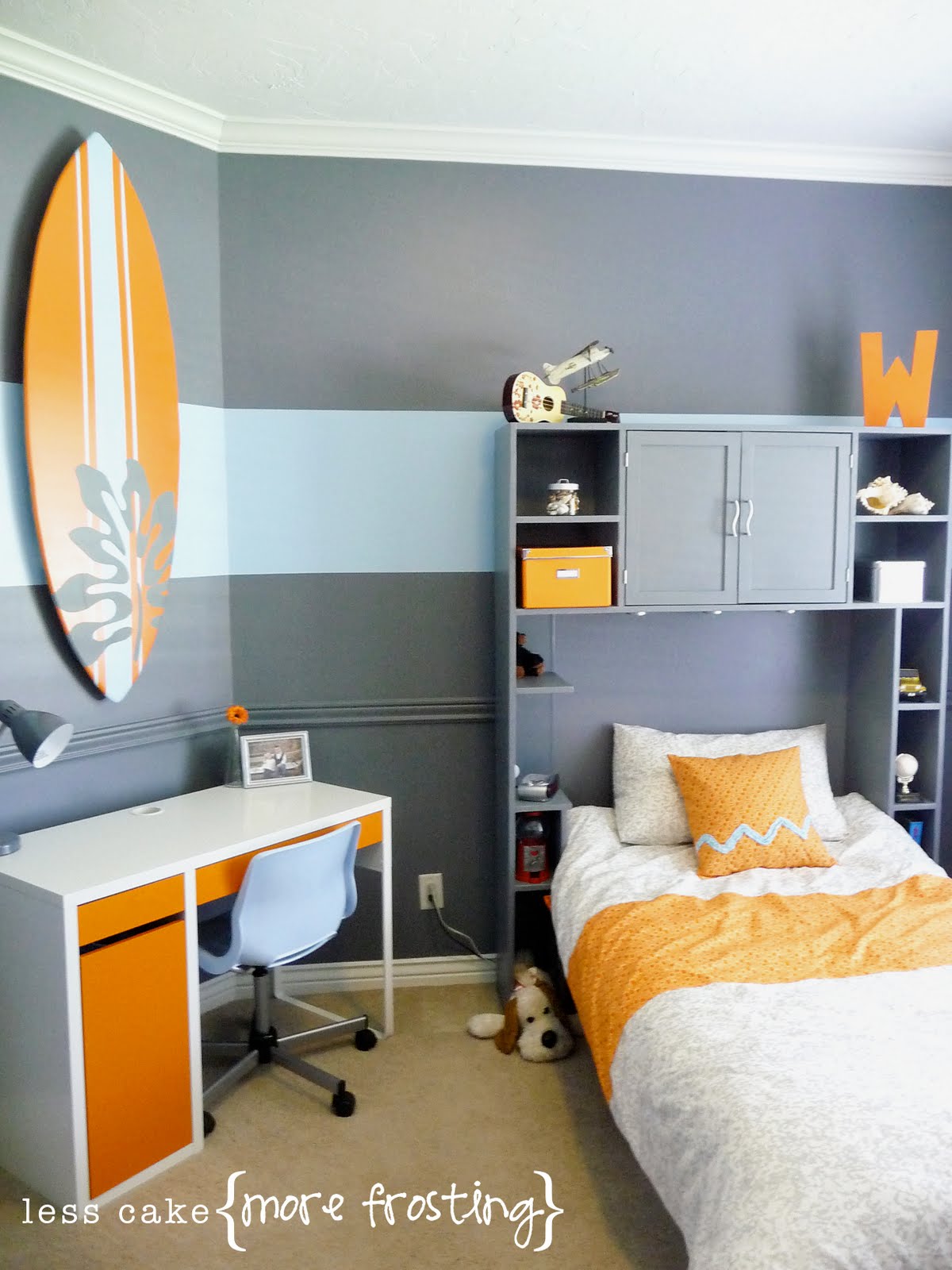
I know I just featured Miss Lara from Less Cake {More Frosting}, but I would be remiss to not show again this *amazing* room transformation she recently executed in her son’s room using a complementary (blue/orange) color scheme. See how the orange is the star here while the muted blue serves as the backdrop? Lovely!
Split Complementary Color Schemes – This is a variation on the complementary color scheme that is comprised of a color and the two colors that lie on either side of its complement on the color wheel. This color scheme provides a wealth of visual contrast, but it helps alleviate some of the possible tension found in a conventional complementary color scheme. I love this scheme!
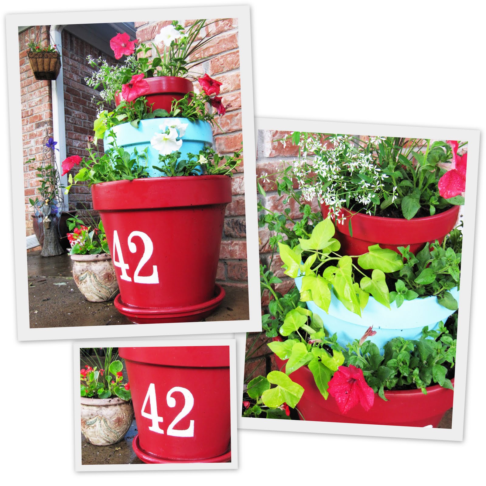
Remember my tiered terracotta planter from this spring? It is a terrific example of a split complementary color scheme. The red of the top and bottom tiers and the flowers is the dominant color, while the blue-green of of the middle tier and the vivid greens of the foliage are the split complements.

Analogous Color Schemes – Analogous colors are those that lie next to one another on the color wheel. These color schemes are generally quite easy to work with, as they lend themselves to fuss-free color harmony.
This Strip-Pieced Pleated Skirt (*love* this!) is a terrific example of an analogous color scheme. The colors come together beautifully because they are all similar, but the different nuances of color make this anything but ho-hum.

Triadic Color Schemes – Color schemes that are comprised of three colors that are equally spaced on the color wheel. This is a very balanced, yet dynamic color scheme.
This silhouette vignette I shared in the spring is a terrific example of this color scheme, which is one of my personal favorites!

Admittedly, this is a lot to think about! But I hope seeing some examples of different projects that effectively incorporate these schemes gives you a full picture of how dynamic the impact of strategic color choices in your projects can be!
If you’re in the market for additional information on this topic, I highly recommend checking out the slideshows linked below. I found them to be extremely informative!
Color Theory Slideshow 1
Color Theory Slideshow 2


Having grown up in a home brimming with sewing notions and paintbrushes, Amy has a deep love for all things creative. On any given day, you’ll find her knee-deep in her latest creative endeavor, with projects ranging from sewing and crafts to home decor and kid-friendly ideas. Amy believes that everyone, regardless of skill level or experience, possesses the ability to create something beautiful, and Positively Splendid was born of her passion for helping others harness their innate creative potential.
Love this, Amy! I’ve always been curious about color wheels, but have never took the time to figure them out. I love the all of the examples you used for each color scheme.
And happy anniversary!!
Wow! I thought I knew the color wheel, but I just learned a lot! I love how you applied color wheels to crafts!! I need to remember this stuff!
LOVE THIS! I think one of the reasons I adore everything you do is because of your bold use of color. I LOVE COLOR! I could stare at a box of crayons forever. (and I MAY or MAY NOT have my very own big box that my kids aren’t allowed to touch) I just love color.
I can’t believe you put that room on there for time #2. You are my hero. And I think we can continue to love color together!
Great post!
Thank you for taking the time to explain the color wheel. Very helpful
LOVED this post!
Thanks for taking the time to explain and write up how it all works! 🙂
I LOVE…. ALL color. ha! Is that wrong? hee hee.
And thanks for your kind words about our blog! You’re so nice! 🙂
I’m just a HUGE fan of your blog, chicky! 🙂
~Shelley
Happy Anniversary, Amy.
Understanding the color wheel makes project planning so much easier!
Thanks for sharing my wreath with your readers. It was a big thrill to see it in your post.